Honeybook Brochure Template Pack { FREE DOWNLOAD }

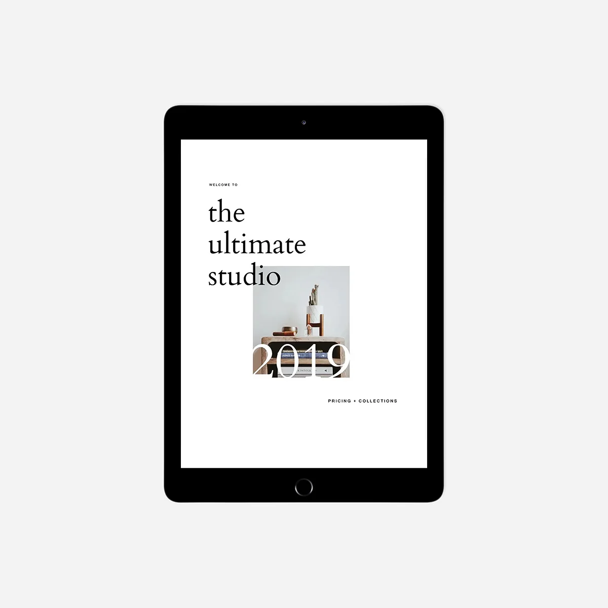
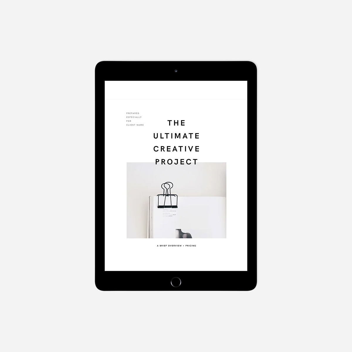
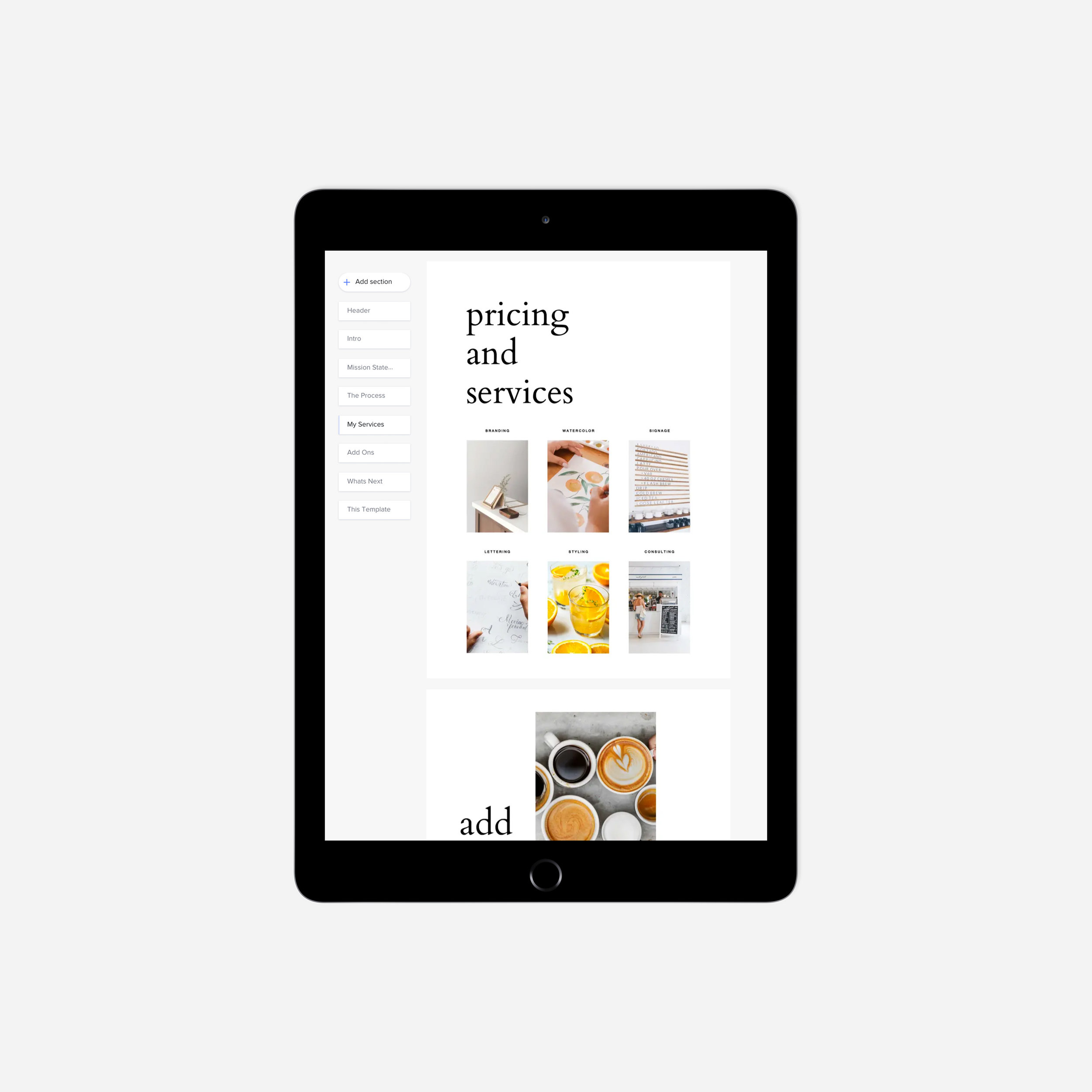
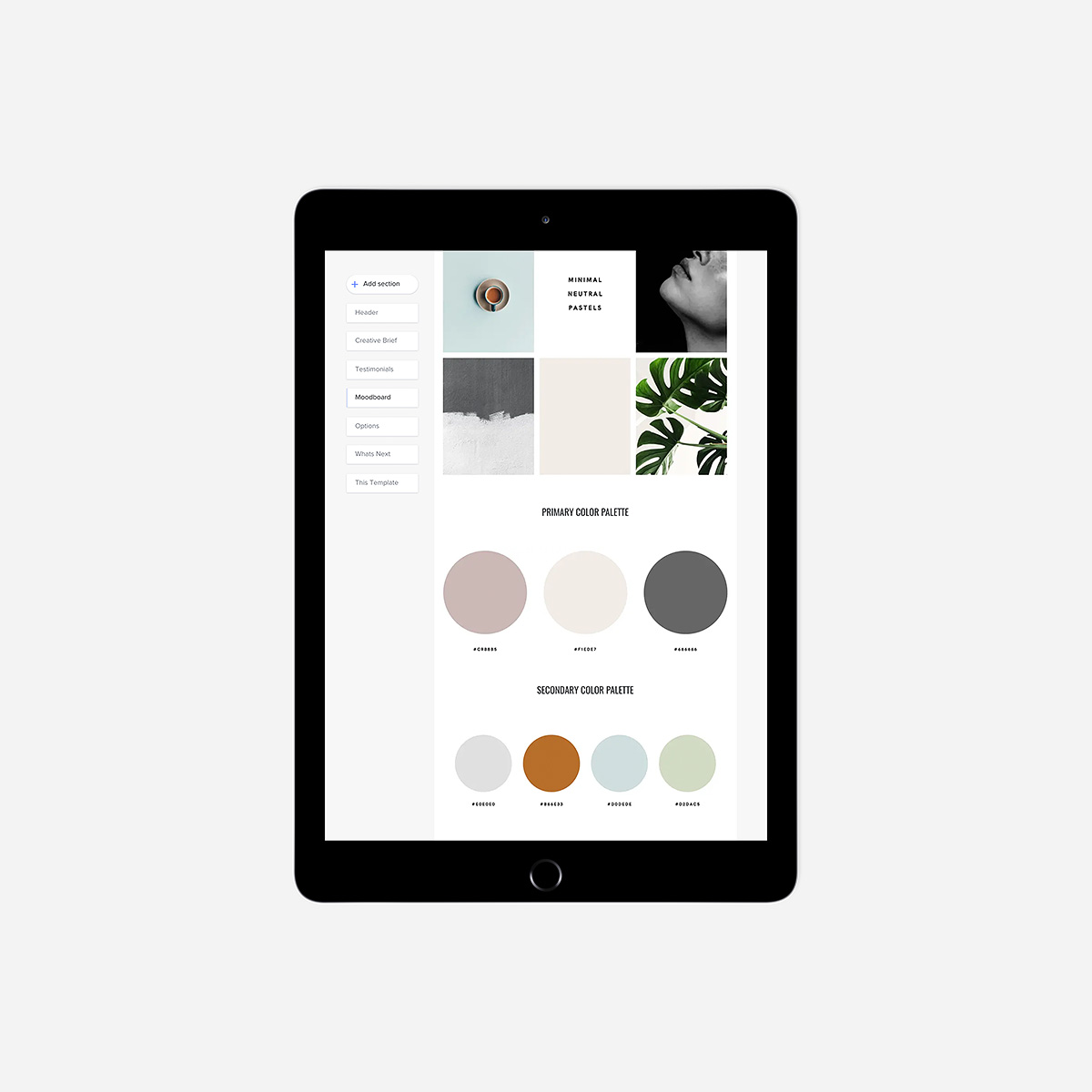
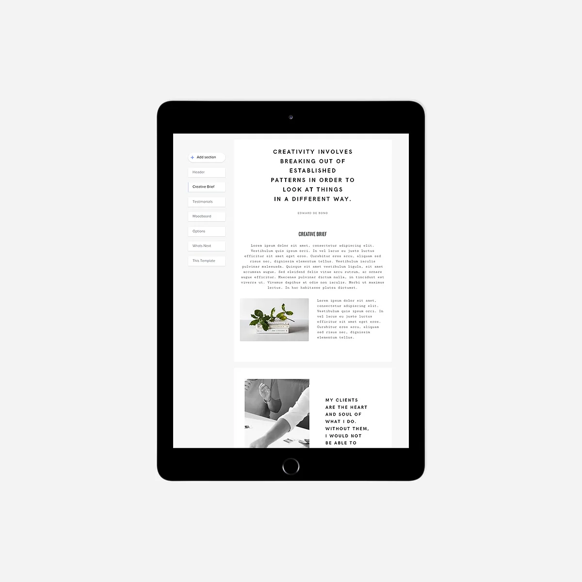
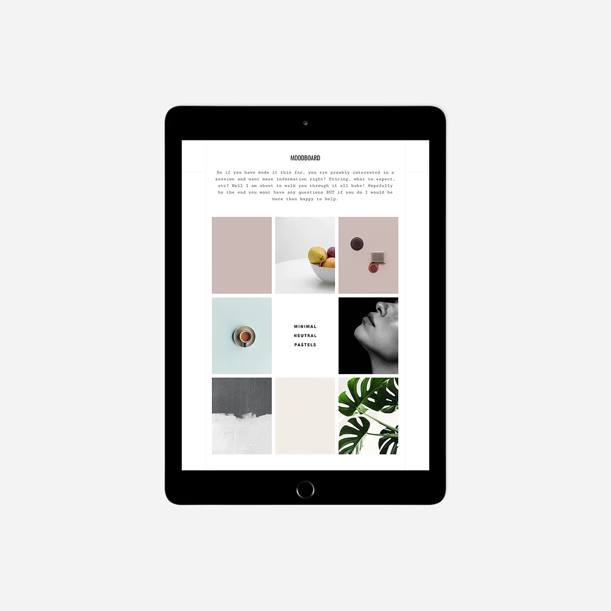
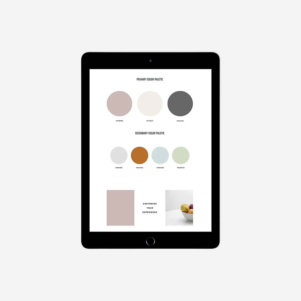
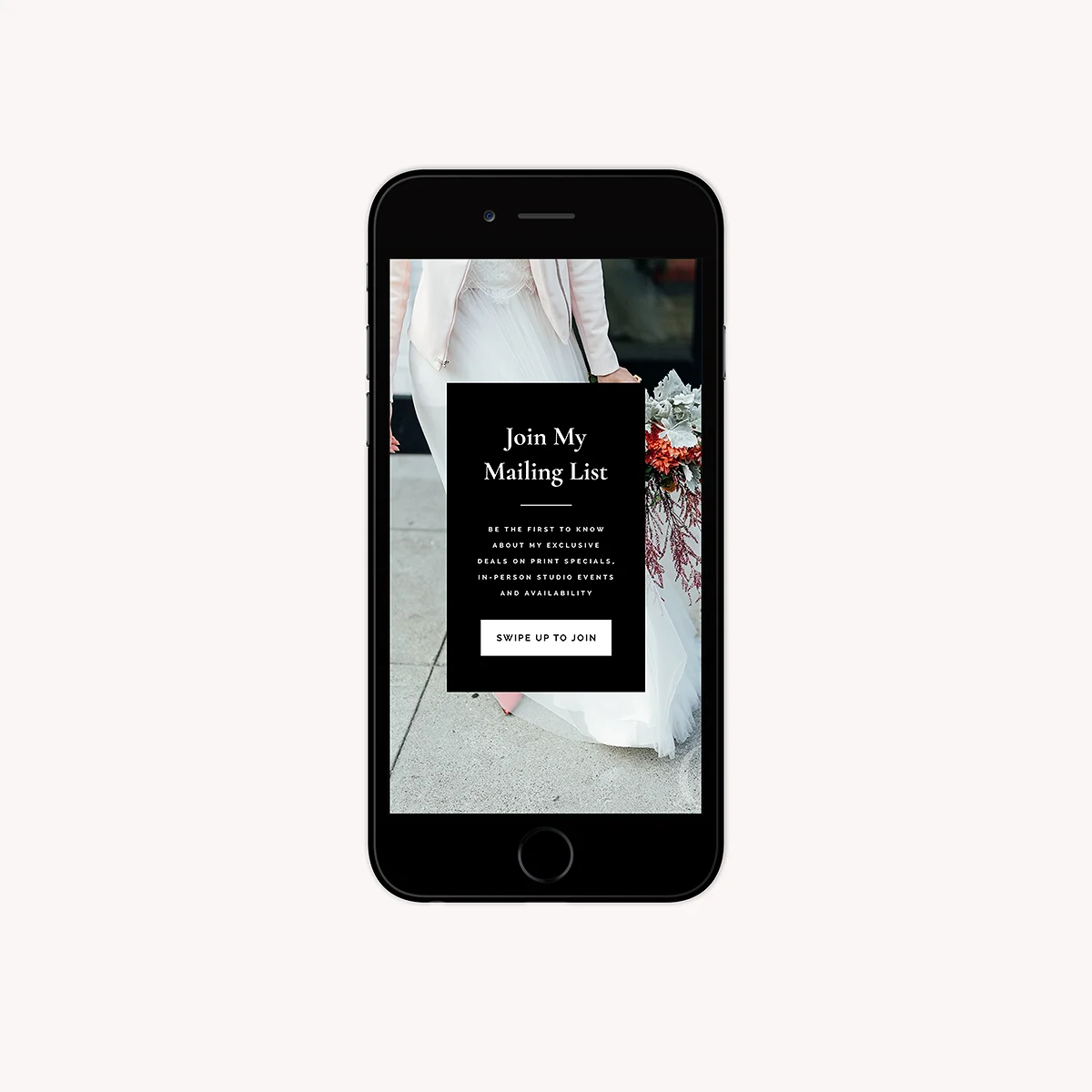
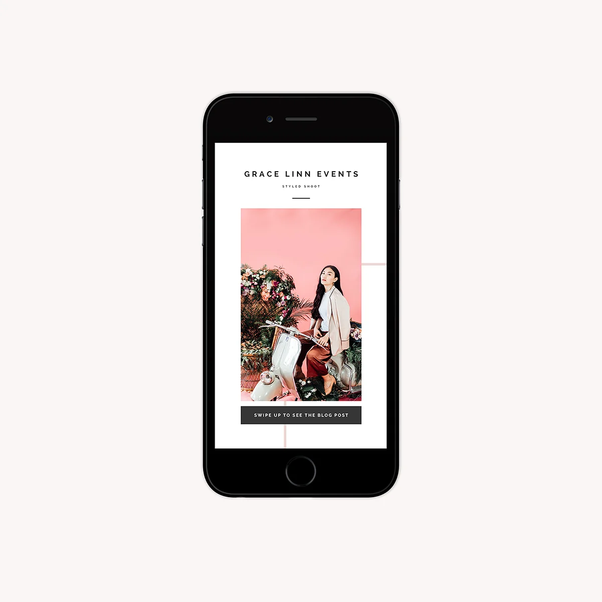
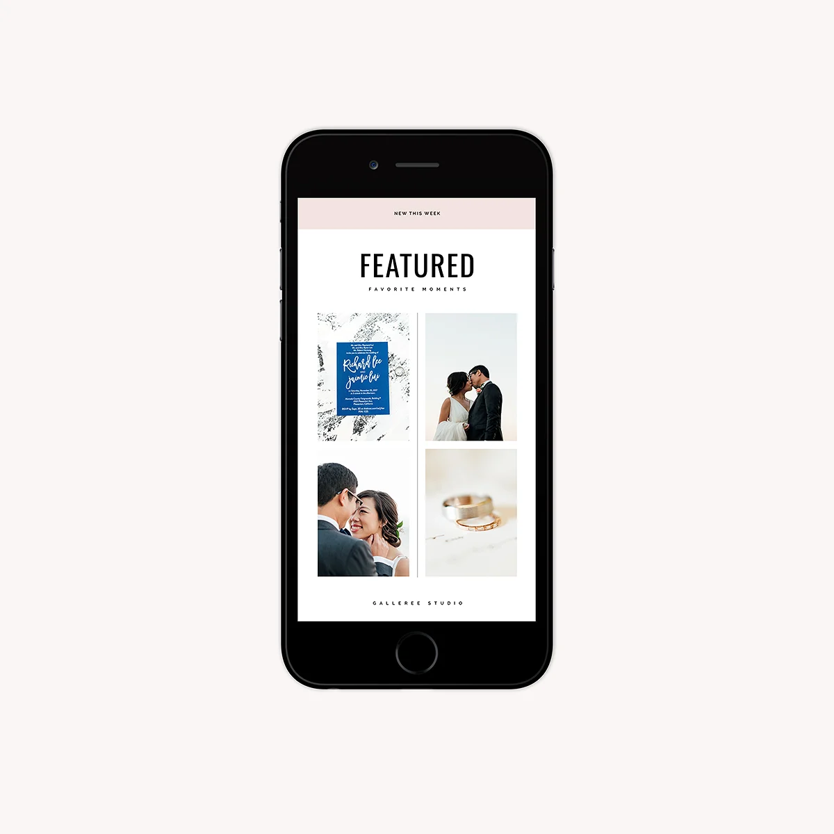
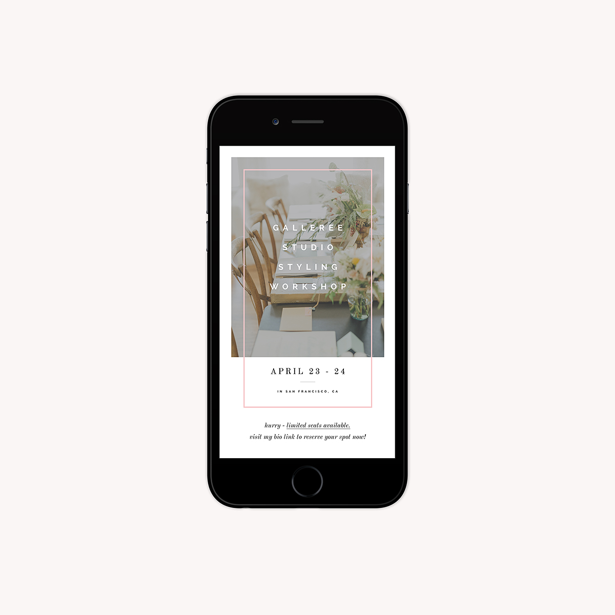
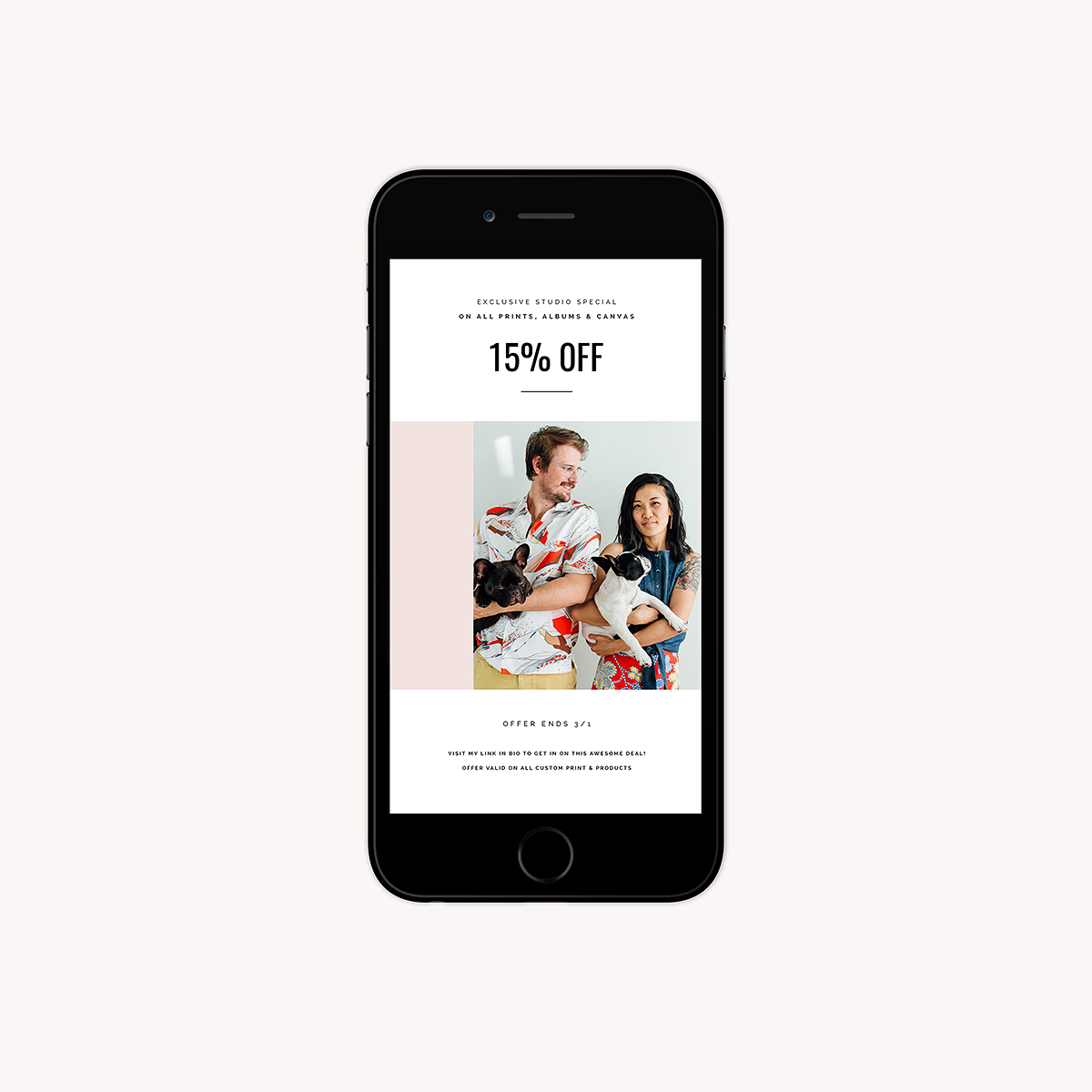
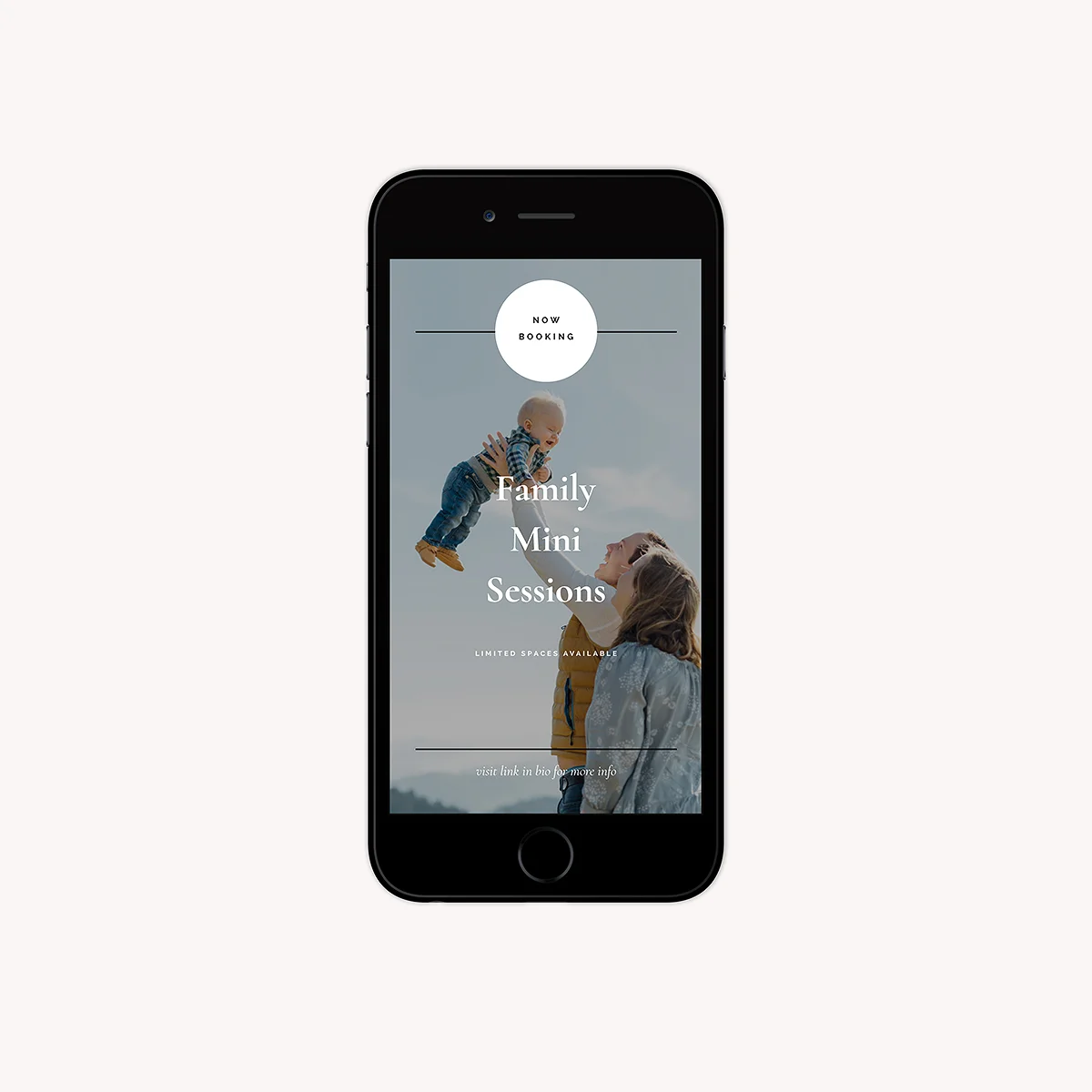
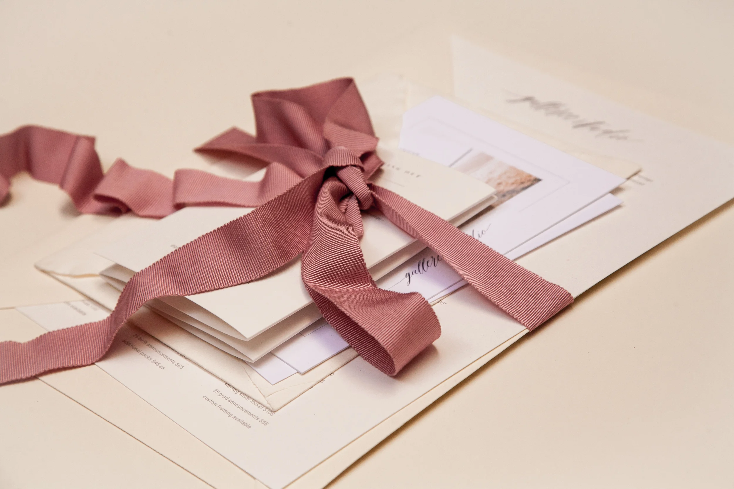
Hi all! We hope you're enjoying Honeybook’s new brochure feature! We partnered with Honeybook to bring you two gorgeous brochure template sets! Every brand needs to be cohesive and professional from the start to finish of the customer journey. These brochure templates allow you to deliver studio information, pricing, process outlines, moodboards, and branding palettes in gorgeous, minimal style! Enjoy!

0.jpg
00.jpg

Download Includes:

1. Pricing & Services basic studio brochure templates (PSD Photoshop files)
2. Storytelling & Moodboard brochure templates (PSD Photoshop files)
3. Instruction set for using the templates

mood.jpg
palette.jpg

ENTER YOUR EMAIL FOR FREE INSTANT DOWNLOAD ACCESS!

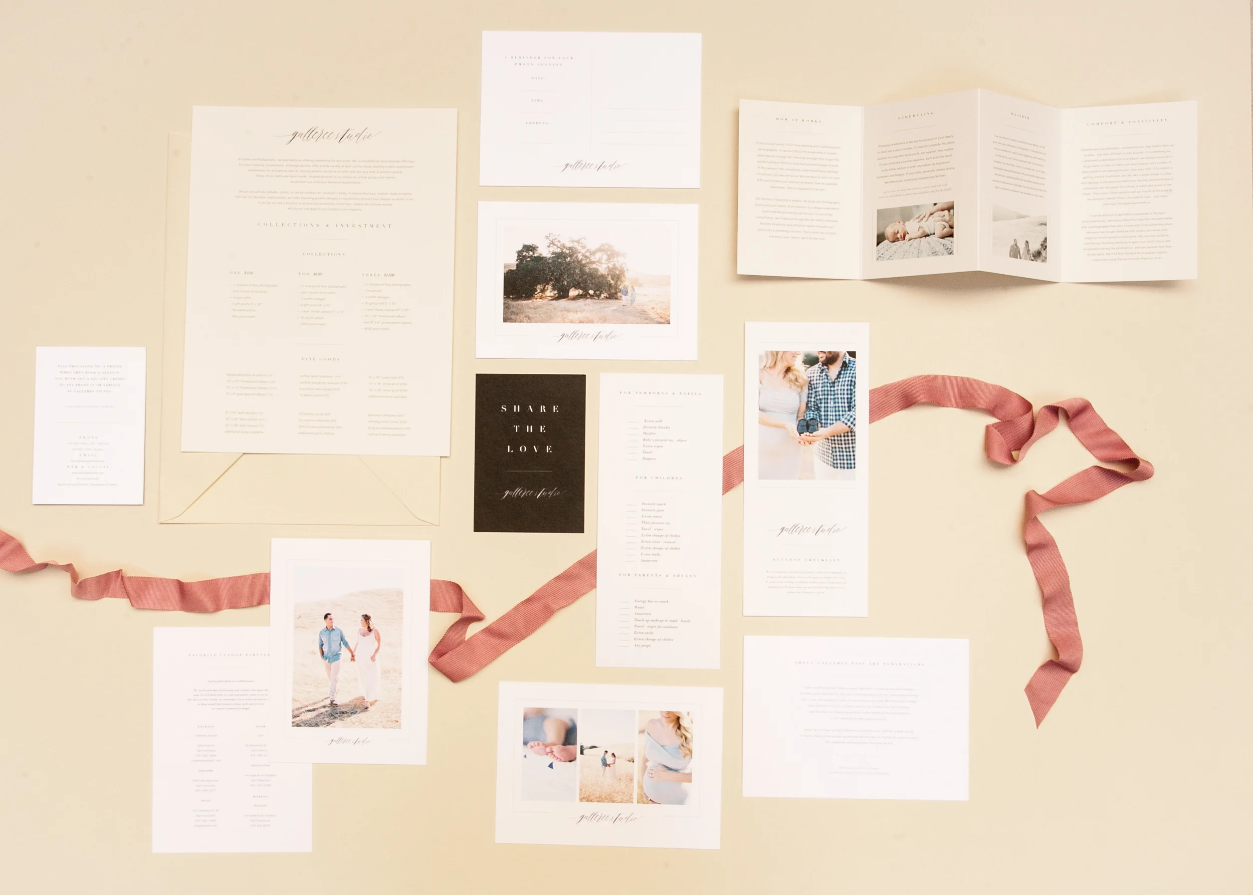
A Beautiful Welcome Packet For Portrait Photographers

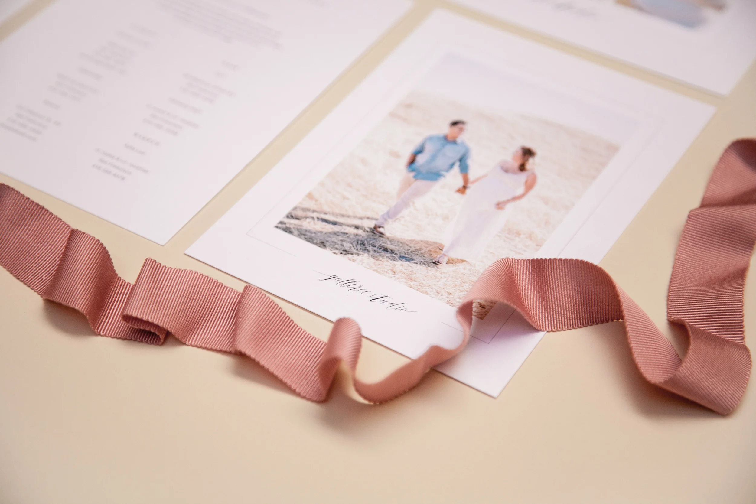
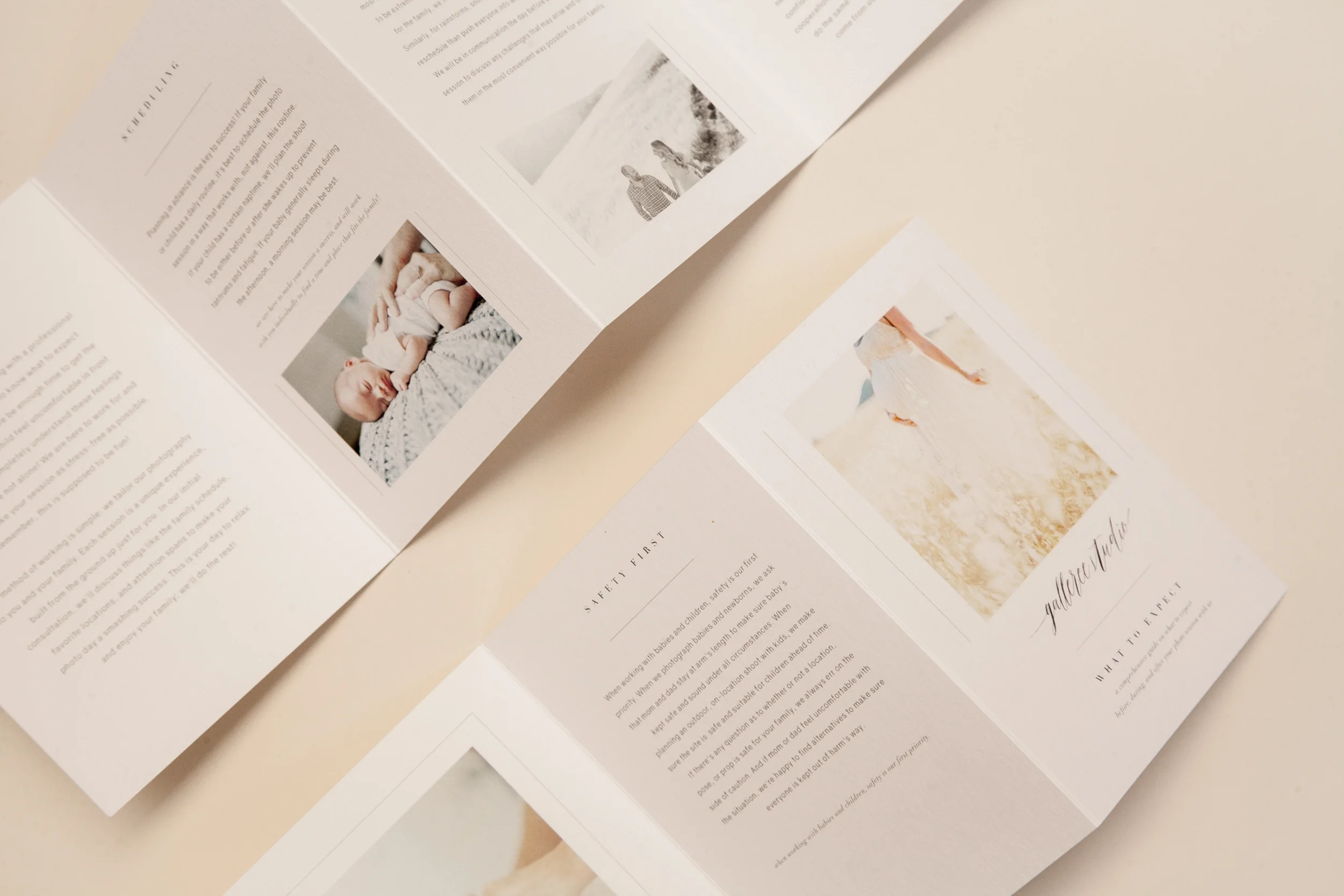
We've just released one of our dreamiest branding sets for photographers. This template is truly stunning and will elevate your images to fine-art gallery status in no time - a place they deserve to be!

With just a basic knowledge of Photoshop, you can customize this template set in minutes and have an amazingly professional looking brand in no time flat. Plus, the cost of the template set is just a fraction of what it would cost to hire a custom designer!

Are you totally obsessed yet? This is one of our favorite templates in the Galler.ee store!

Shown here featuring the images of Shauntelle Sposto Photography!

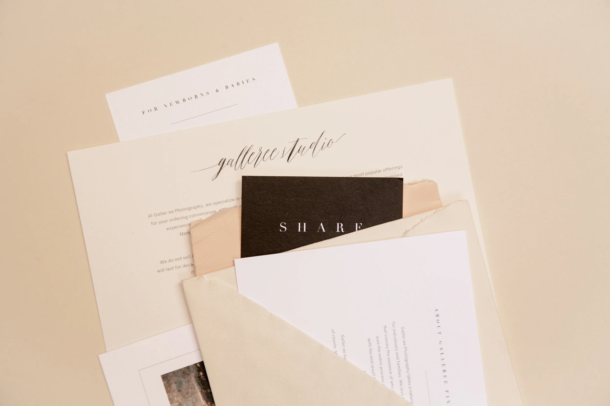
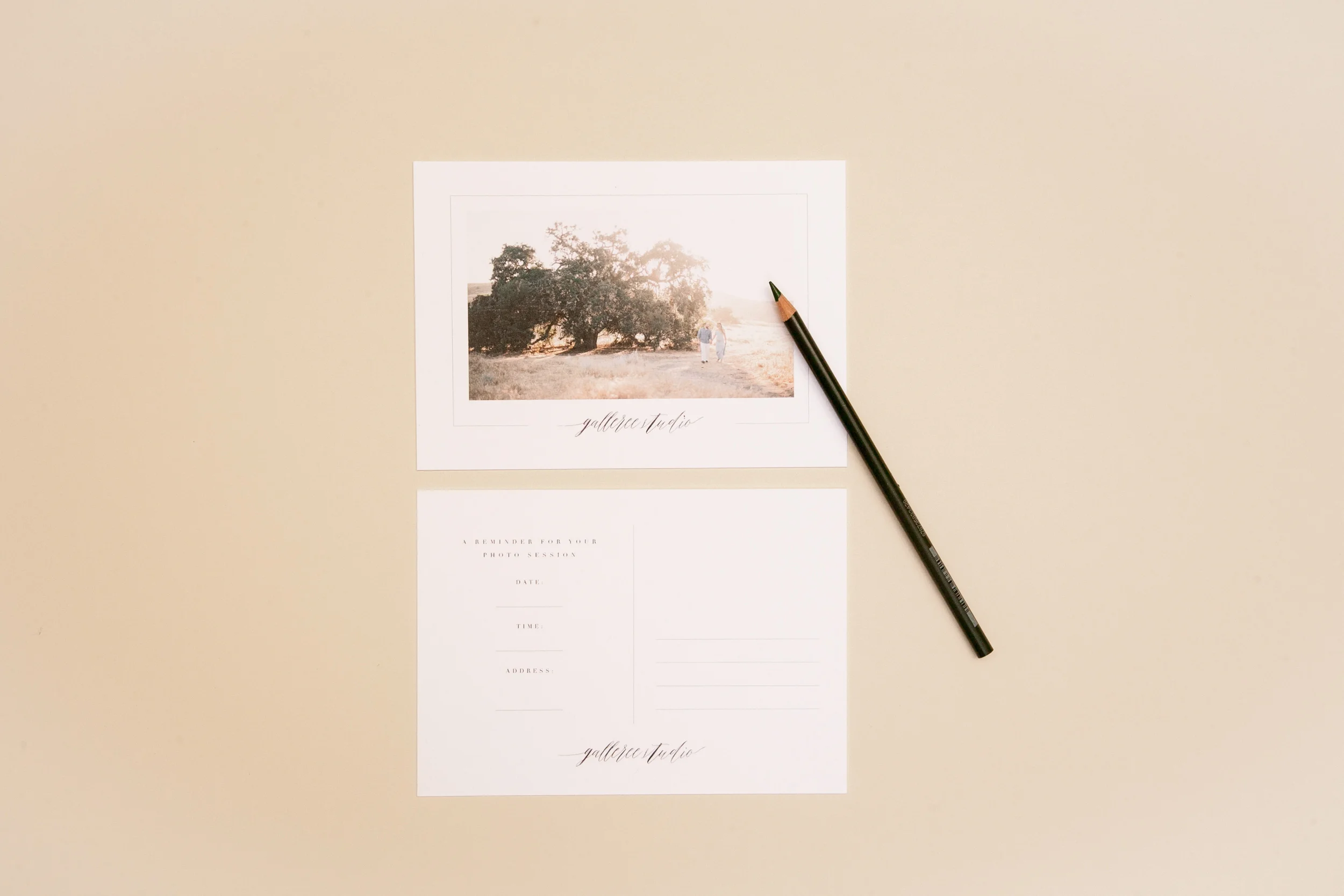
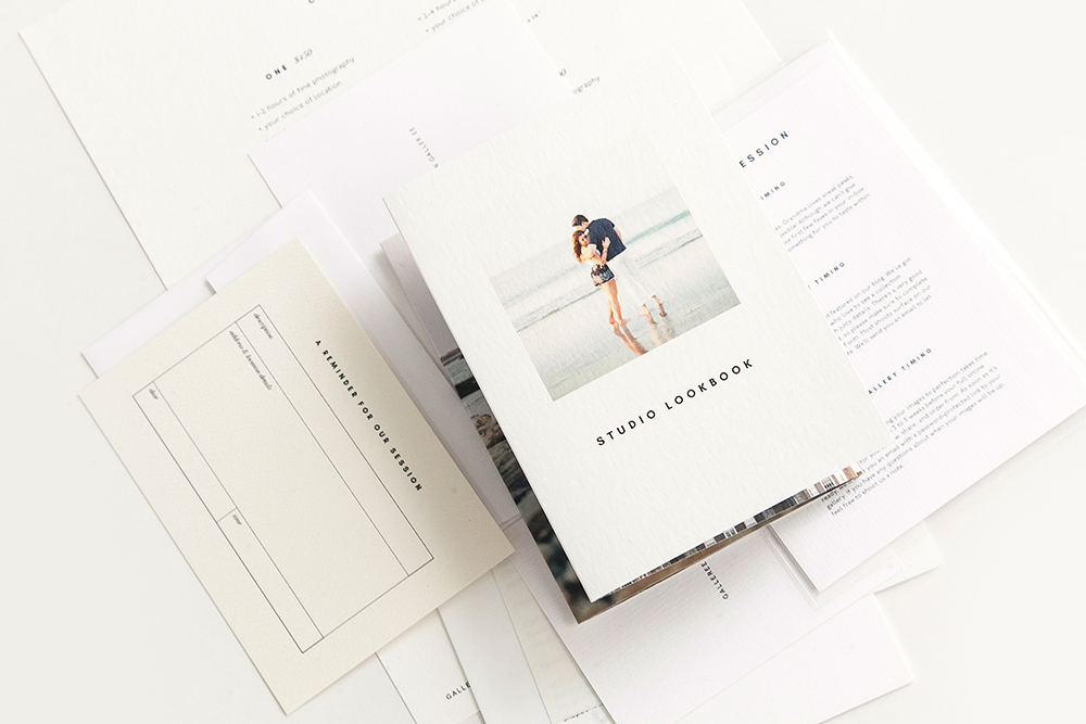
The packet includes seven unique pieces offering clients an intensive overview of your studio’s philosophies, photoshoot policies, what to expect, how to prepare for a session, and much more. Crafted with portrait photographers in mind but may also be customized for an elegant wedding studio brand.

IMG_5187.jpg

Holiday Cards For Photographers Roundup

Holiday cards are a great way to make a little extra cash during the holiday season. Most clients, especially families and newlyweds, love sending out a greeting to friends and family during the chilly season. Offering them beautiful designs alongside their images is super-duper important. But which holiday cards should your studio offer? There are so many options out there to choose from these days!

At Galler.ee, we've been creating holiday cards for photographers for five years now (!). After lots of feedback from thousands of customers, tons of market research, and a lot of trial and error, we've been able to create holiday card templates that really sell well to clients. Here are some of our best-selling designs:

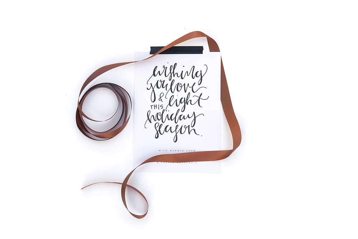
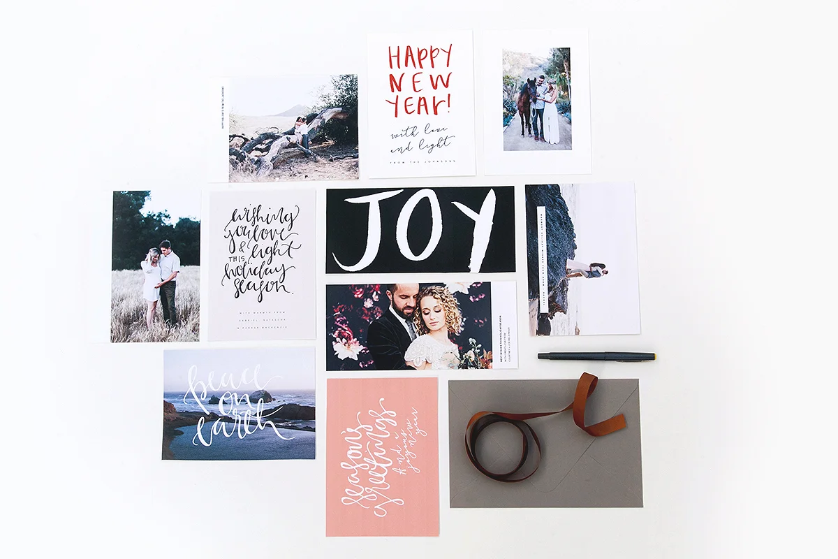
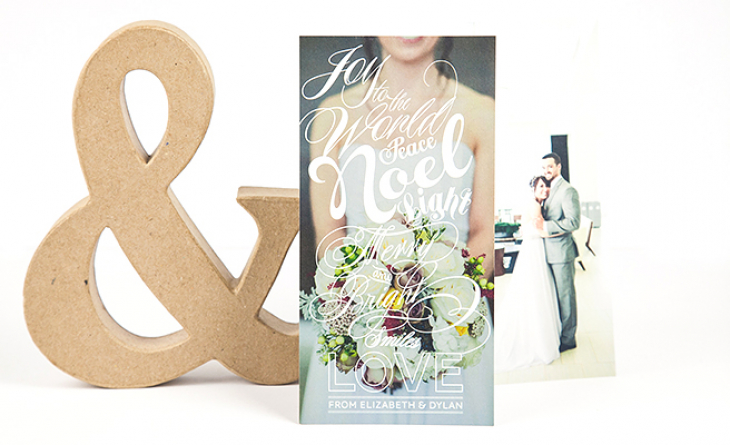
1. Calligraphy inspired cards. "Calligraphic Holidays", released this year, is a beautiful holiday card set featuring custom calligraphy in a variety of messages. Perfect for any clients but especially recommended for couples and newlyweds! Available here.

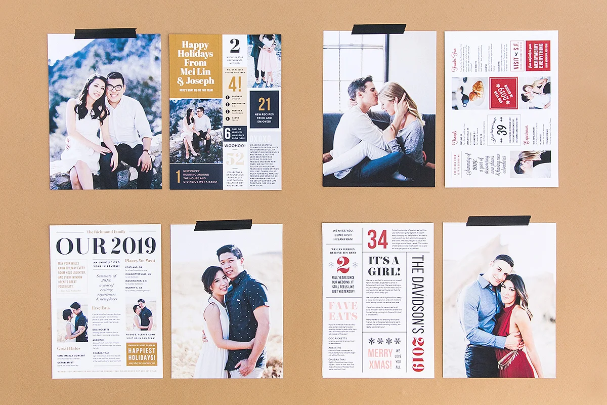
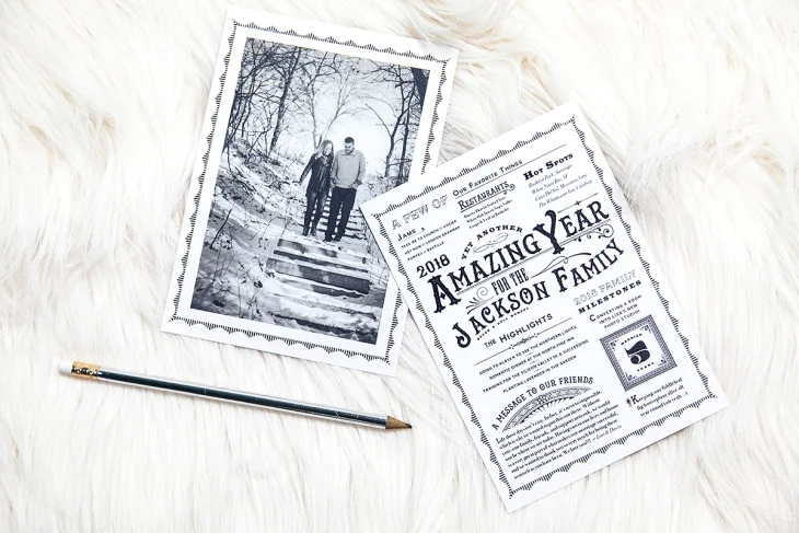
2. Year In Review. "Year In Review" cards are always a hit with families! They're so much fun to customize with all sorts of information about what the family has done that year. We have several sets available here and here


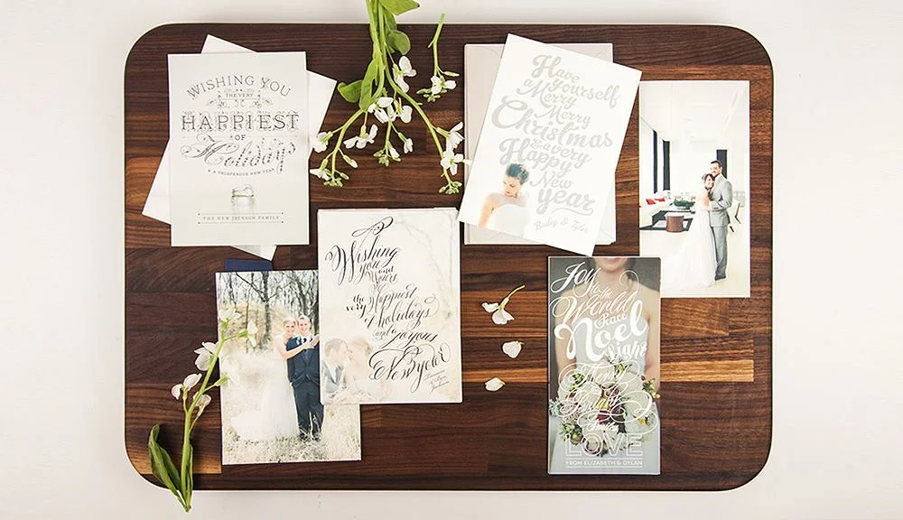
3. Classic Script Holiday Cards. Our "Flourish" script-inspired holiday cards are a top seller year after year! Available here.

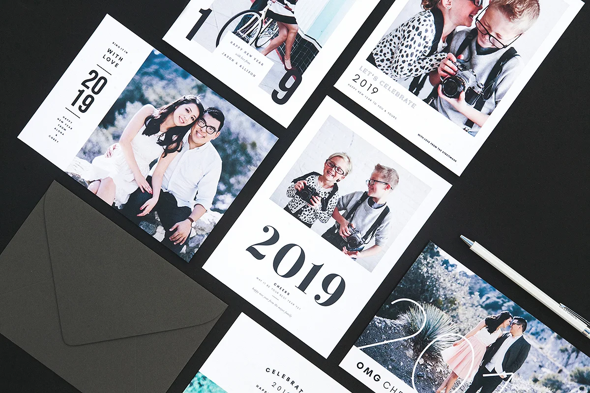
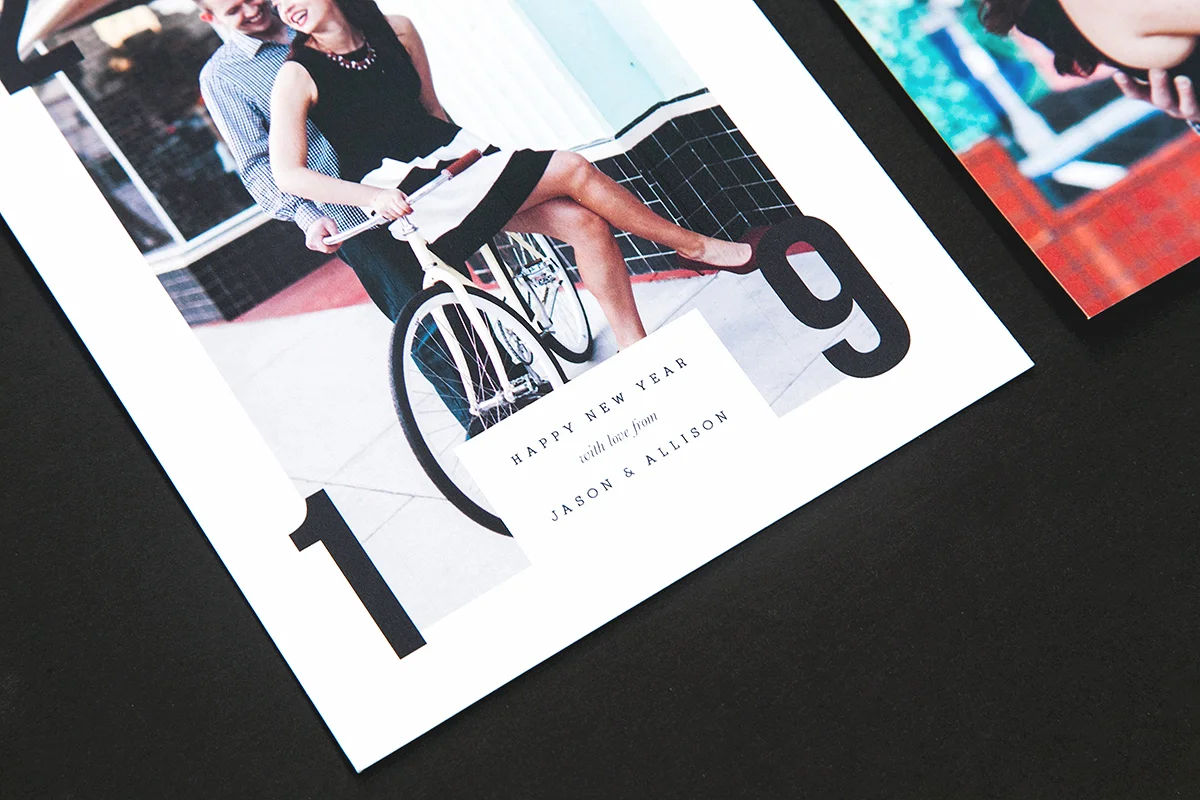
4. New Year's Cards. Lastly, for clients who are a little late to the holiday card game, New Year's greeting cards are always a wonderful way to connect with friends and families after the Christmas deadline. New Year's cards can be sent out anytime from end of November to the end of January, so there's plenty of time to get them out without stress! Our "Ring It In" New Year's card set got a lot of attention this year, available here.

IMG_6532.jpg

No matter what tastes your clients have, Galler.ee has holiday cards for every photography studio! To see more, check out our holiday design section available here

Branding For Photographers: Matching Your Brand To Your Images

One of the things we love most here at Galler.ee is branding! In fact, if we had it our way, we'd just be releasing branding and welcome packets all day long (seriously!). Truth be told, branding is incredibly important for photographers. In fact, it's essential. Your brand isn't just a logo or a color, it's a communication about who you are and what you offer your clients. Your branding should reflect what style of images you take, how you edit them, and what kind of clients you'd like to attract. If you love vintage rustic barnyard weddings and want to photograph more of those, make design choices that communicate a vintage/rustic vibe. If you love taking clean photographs in urban spaces, a more minimal branding strategy may suit you best. One of our biggest pieces of advice for photographers:

Choose a design style that aligns with your photographs.

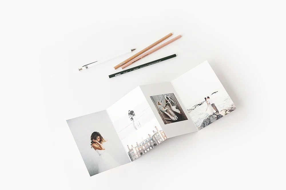
What's most important about your branding is not that you pick any certain style (modern minimal, vintage chic, floral, etc.) but that the design style is consistent with your images. If you like to take clean, modern photographs without a lot of background content and with simple compositions, a minimal design style will look great, as seen with these images in our Brand Set 01: Sans Welcome Packet (images by Brumley & Wells Photography):

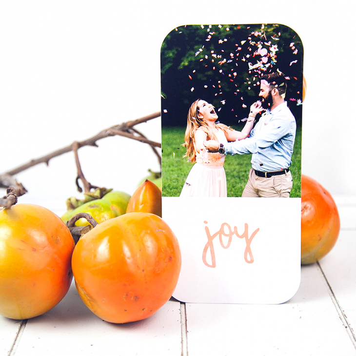
If your images have more complex backgrounds, colors, or a vintage flair, choose a branding set and design products that communicate that image style. In this hand-painted holiday card set, these beautiful images (by Alyssa Morgan Photography) are a little more rustic to go along with the painted typography:

Note: Don't forget that your brand is more than just a logo or a welcome packet. It's everything you do, say, and put out there for your clients to see. Your brand consists of everything from a logo, welcome packet, and website header design down to the material of products you offer, card designs, layout styles, and so on. Once you have a consistent look and feel throughout your business, you'll be communicating the right message to attract the right kind of clients

Out To Launch

The following is a personal story written by Rebecca Shostak, founder and owner of Galler.ee Inc.

The only thing harder than coming up with a new business idea is taking an old one and making it new again. After 5 years in business, I was starting to struggle with where my company Galler.ee Inc. should go. When I started Galler.ee, the kind of graphic design that was in vogue was the Portlandia-inspired, mustache-laden hipster throwback aesthetic. It was a very loud and over-the-top design style, easy to define and easy to recreate. As time went on, however, this style fell out of fashion, and I found it difficult to pinpoint where exactly design was headed. After all, my biggest job at Galler.ee is to figure out what design style(s) are going to be considered high-end and cutting edge, then bring them to our photographer audience so they can add value to their brand. I felt lost; what did photographers want these days? Where is ivory tower graphic design headed? Was I losing my grip on the design world? I didn’t know what to do.


There were other issues, too. When we opened in 2011, there was competition in the photography template industry, but nothing like there is now. Galler.ee designs were pirated right and left on torrent sites while other competitors took what we did and nearly copied it, offering it for half price. More template companies popped up on Etsy, Creativemarket, etc. Deal sites kept running template files for cheaper and cheaper, until they were devalued to tenths of what they were 5 years ago. But that’s business, right? Things get competitive. You have to be cutthroat. But it disheartened me. To be honest, I almost gave up.
 

Almost. But Galler.ee still had plenty of customers, and some of my closest friends and advisors suggested I try new avenues. A new look. Fresh ideas. So many photographers were asking Galler.ee for “minimal” design, and although I saw so many other template companies tout their designs as “minimal”, I asked what that really meant. Being a design academic, I took this “journey to find the next wave of design” very seriously. I looked for inspiration in San Francisco, went to the design bookstore here in Japantown for the very latest books on the subject, went to modern art museums, and had many late-night chats with fellow creatives in the city. I saved menus from high-end coffee shops and restaurants, dissecting their typography choices and color theory. I read blogs, pinned endlessly, and chatted with lots of photographers, artists, and designers. I didn’t look for ideas within the template industry; I looked for them in the highest echelons of design firms around the globe.
 

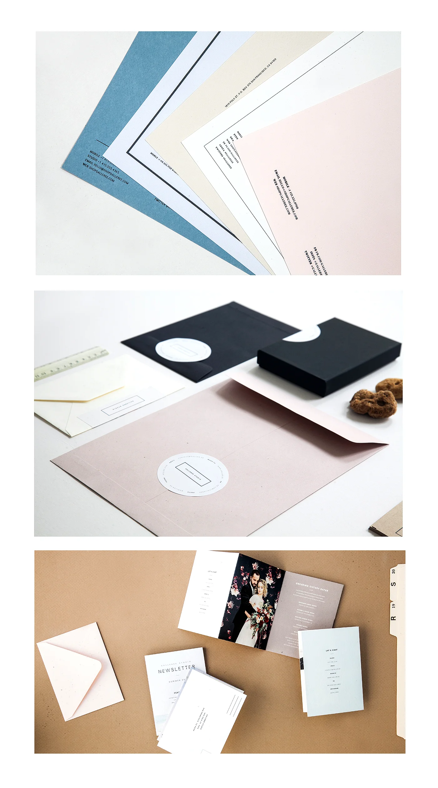
After filling my head to the brim with the concept of “the new minimalism”, which is considered to be the next wave of popular graphic design, I got to work with my team. In order to make a big shift in our vision and aesthetic, I had to pause our weekly releases for the Summer. We worked harder than we ever have in the history of Galler.ee to come up with 30 new products, design them, and style them in a fresh way. I was tired of styling with florals and “rustic” elements, gold staplers and turquoise office products; everyone is doing that now. I wanted modern. Really modern. We looked to 1950’s office aesthetic, 1970’s color choices, and classic Bauhausian minimalism to inform every choice we made for the new Galler.ee. Everything from the font on the website to the pens displayed in our product photographs had this intent behind it. Some days it felt like we were feeling around in the dark. Lots of questions about what was the right thing to do. But we kept going to meet the self-imposed deadline of September 15. It became our mantra, and every second of every day I couldn’t stop thinking about Galler.ee. I didn’t know how it would all come together either; you never fully do until you have it all right there in front of you. I wanted to create a design world that photographers could buy into and make their business look next-level. I wanted to create something of an Ikea for photographers, where although each design piece is unique, they would all have a level of consistency when sat side-by-side together. And I wanted to bring photographers the kind of design firms pay tens of thousands of dollars for, for just $25/month.
 

Finally, September 14 rolled around, and we launched. What happens next is still untold, but I feel amazing about the new Galler.ee. It’s some of the best work I’ve ever done in my life, and I’m thrilled to share it with photographers and the rest of the world. I’m confident that the new direction Galler.ee is pursuing will give photographers an edge in their business and branding. And most of all, I’m thrilled that I answered my own question about where design is going next.

You can see our new website and products now at www.shopgalleree.com!